1.Matplotlib简介
1.1 Matplotlib 简介
Matplotlib 是 Python 编程语言及其数值数学扩展包 NumPy 的可视化操作界面。它为利用通用的图形用户界面工具包,如 Tkinter、wxPython、Qt 或 GTK+ 向应用程序嵌入式绘图提供了应用程序接口(API)。
此外,Matplotlib 还有一个基于图像处理库(如开放图形库 OpenGL)的 pylab 接口,其设计与 MATLAB 非常类似。SciPy 就是用 Matplotlib 进行图形绘制。
python
import matplotlib as mpl              # 导入Matplotlib,用于设置全局样式、参数
import matplotlib.pyplot as plt       # 导入绘图接口,用于画图

# 指定具体中文字体
mpl.rcParams['font.family'] = 'sans-serif'
mpl.rcParams['font.sans-serif'] = ['SimHei']

# 不使用unicode_minus模式处理坐标轴轴线为负数的情况
mpl.rcParams['axes.unicode_minus'] = False
1.2 Matplotlib 基础函数大全
python
plot()           # 变量趋势变化
scatter()        # 变量之间关系
xlim()           # x轴数值显示范围
xlabel()         # x轴的标签文本
grid()           # 绘制刻度线的网格线
axhline()        # 绘制平行于x轴的水平参考线
axvspan()        # 绘制垂直于x轴的参考区域
annotate()       # 添加图形内容的指向注释(文本)
text()           # 添加图形内容的非指向文本
title()          # 添加图形内容的标题
legend()         # 标示不同图形的文本标签图例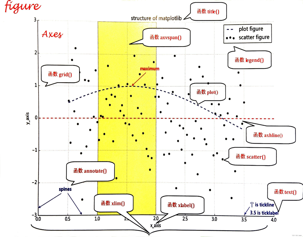
1.3 读入数据
pd.read_csv 函数
!后面加linux命令可以直接在notebook里面执行iloc方法需要传入行索引(切片)或者列索引(切片),用逗号分隔开
python
!ls -lr # 列出当前目录内容(按时间逆序)
df = pd.read_csv('./tips_new.csv').iloc[:, 1:] # 读取CSV文件,并去掉第0列
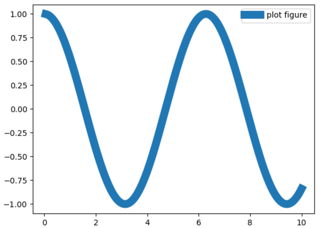
print(df) # 输出DataFrame内容1.4 折线图
plt.plot 函数,默认折线图
- 横纵坐标分别是
x和y参数(x,y 长度需一致) ls代表图线风格,lw代表图线宽度label代表图像标签- 因为
x轴数值稠密,所以折线图才会光滑
可以用魔法方法查看 plot 的参数:
| ls | 效果 | 说明 |
|---|---|---|
'-' | ───────── | 实线(默认) |
'--' | ─ ─ ─ ─ ─ | 虚线 |
'-.' | ─ · ─ · ─ | 点划线 |
':' | ⋯⋯⋯⋯⋯⋯⋯⋯ | 点线(细虚线) |
| lw | 线条粗细效果 |
|---|---|
lw=0.5 | 很细 |
lw=1 | 默认 |
lw=2~3 | 较常用,适中 |
lw=5以上 | 很粗,用于强调 |
| c | 全名 | 颜色 |
|---|---|---|
'r' | 'red' | 红色 |
'g' | 'green' | 绿色 |
'b' | 'blue' | 蓝色 |
'k' | 'black' | 黑色 |
'y' | 'yellow' | 黄色 |
'm' | 'magenta' | 洋红 |
'c' | 'cyan' | 青色 |
'w' | 'white' | 白色 |
| marker | 描述 |
|---|---|
'.' | 点 |
',' | 像素 |
'o' | 圆圈 |
'v' | 下三角 |
'^' | 上三角 |
'<' | 左三角 |
'>' | 右三角 |
'1' | 下三叉 |
'2' | 上三叉 |
'3' | 左三叉 |
'4' | 右三叉 |
's' | 方形 |
'p' | 五边形 |
'*' | 星形 |
'h' | 六边形 1 |
'H' | 六边形 2 |
'+' | 加号 |
'x' | 叉号 |
'D' | 菱形 |
'd' | 窄菱形 |
'_' | 横线, 竖线用“|” |
python
%matplotlib inline                     # 在Jupyter中内嵌显示图像,否则会弹出窗口

import matplotlib.pyplot as plt
import numpy as np

x = np.linspace(0.05, 10, 1000)         # x = 0.05到10的等间距1000个点
y = np.cos(x)                           # y = cos(x)

# ls=图线风格, lw=图线宽度, label=图像标签
plt.plot(x, y, ls="-", lw="2", label="plot figure")   # 绘制图
plt.legend()                                          # 绘制图例
plt.show()                                            # 显示图像
python
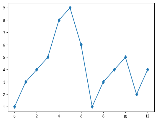
import matplotlib.pyplot as plt
import numpy as np

ypoints = np.array([1,3,4,5,8,9,6,1,3,4,5,2,4])

plt.plot(ypoints, marker = 'd')
plt.show()
在 Chrome 中,可以使用 Ctrl+Shift+右键 复制图片
1.5 绘制 df 数据
plt.figure可以预先设置图形大小和清晰度plt.plot可以对 series 绘图,所以使用 df 指定列即可,横轴为 索引(index)- 图片可以保存,利用
plt.savefig函数
python
plt.figure(figsize=(30,12), dpi=80)      # 设置图形大小和清晰度
plt.plot(df['tip'], ls="-", lw="2", label="dataframe test")   # 绘制线图
plt.legend()                             # 绘制图例
plt.savefig('image01.png')               # 保存图片
plt.show()                               # 显示图像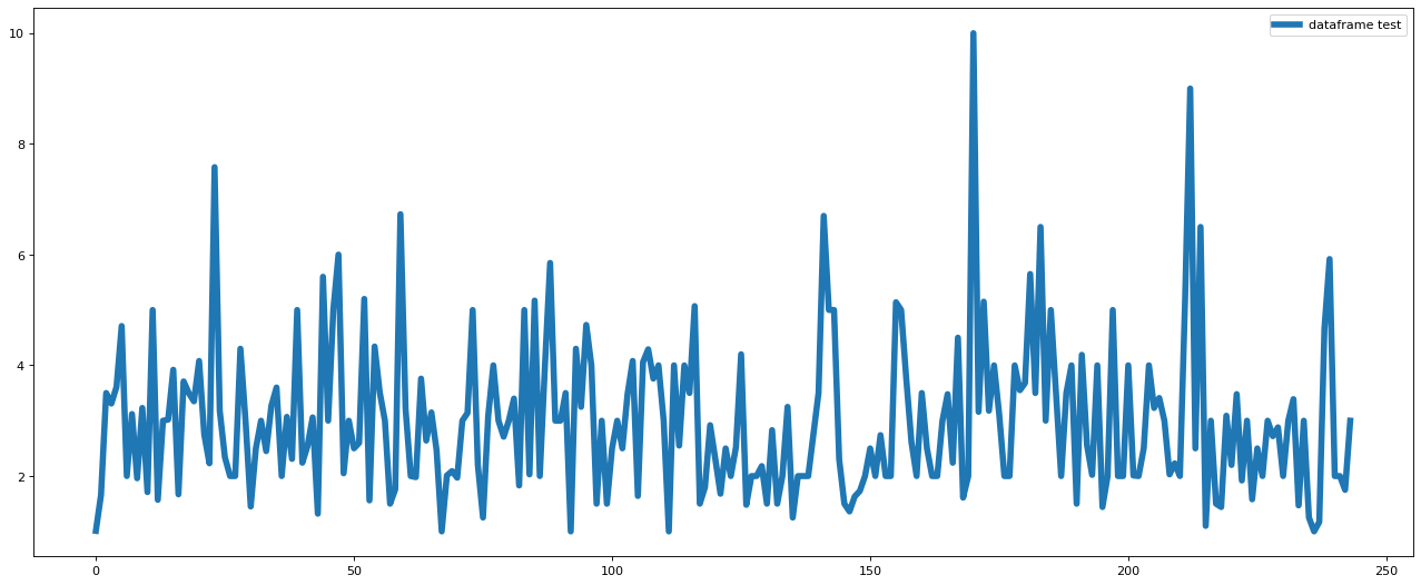
1.6 绘制散点图
plt.scatter函数需要指定横轴和竖轴- 同样支持 dataframe 数据
python
import matplotlib.pyplot as plt
import numpy as np

x = np.linspace(0.05, 10, 1000)      # 生成 0.05 到 10 的等间距 1000 个点
np.random.seed(2024)                 # 设置随机种子
y = np.random.rand(1000)             # 生成 1000 个随机数作为 y

plt.scatter(x, y, label="scatter figure")   # 绘制散点图
plt.legend()                                # 显示图例
plt.show()                                  # 显示图形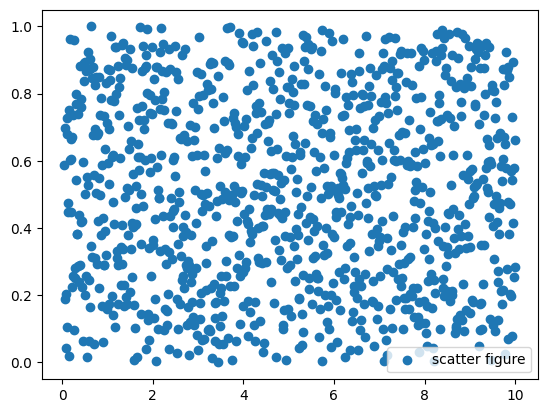
1.7 设置坐标显示范围
- 与上一页使用的数据相同
- 想展示经过筛选的,用
xlim/ylim xlim是对横轴范围进行筛选,ylim是对纵轴范围进行筛选- 比较像裁剪,显示的圆点可能被切割
python
import matplotlib.pyplot as plt      # 导入绘图库
import numpy as np                   # 导入数值计算库

x = np.linspace(0.05, 10, 1000)      # 生成 0.05 到 10 的等间距 1000 个点
np.random.seed(2024)                 # 设置随机种子
y = np.random.rand(1000)             # 生成 1000 个随机数作为 y

plt.scatter(x, y, label="scatter figure")   # 绘制散点图
plt.legend()                                # 显示图例

plt.xlim(0, 10.5)                       # 设置横轴范围
plt.ylim(0, 1)                          # 设置纵轴范围

plt.show()                              # 显示图形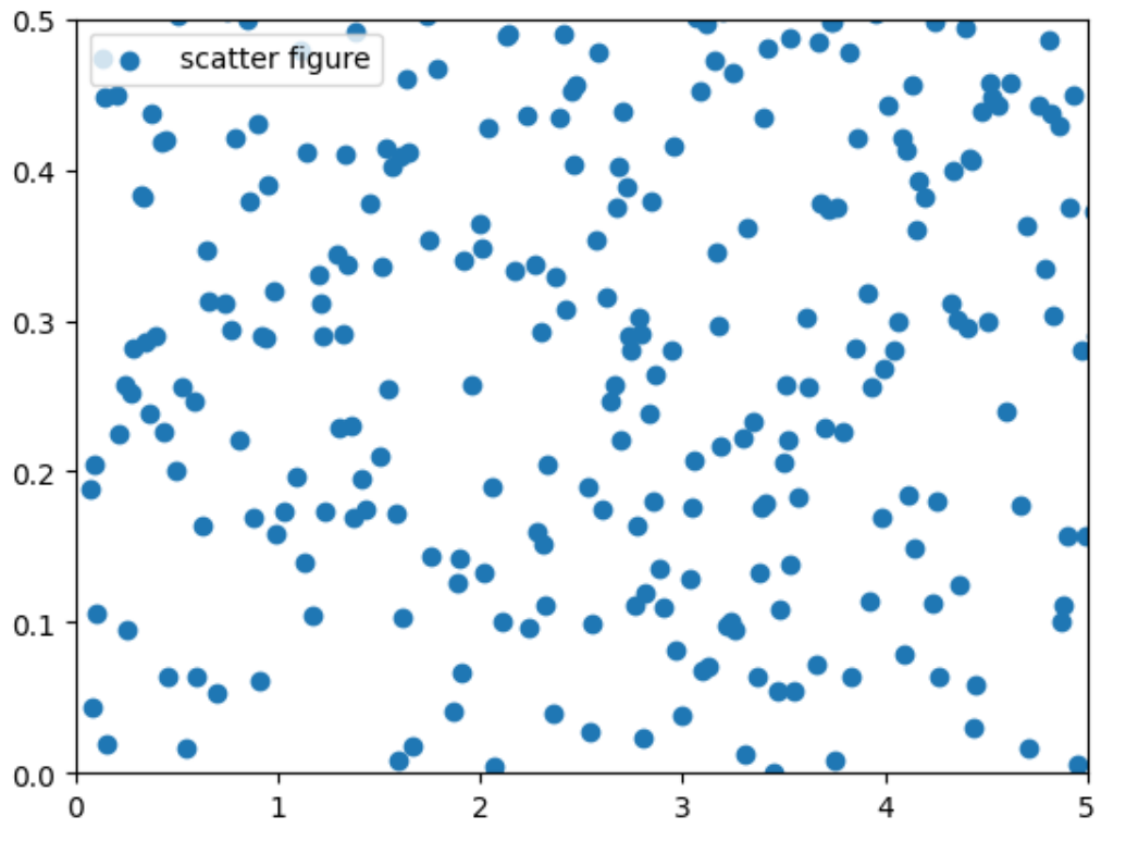
1.8 坐标轴命名
xlabel为横坐标命名,ylabel为纵坐标命名- 几乎所有的可视化的最后阶段产出都需要重命名,才能更清晰地表达图形含义
python
import matplotlib.pyplot as plt    # 导入绘图库
import numpy as np                 # 导入数值计算库

x = np.linspace(0.05, 10, 1000)    # 生成 0.05 到 10 的等间距 1000 个点
y = np.sin(x)                      # 计算 y = sin(x)

plt.plot(x, y, ls='-', lw='2', label='plot figure')   # 绘制折线图
plt.legend()                        # 显示图例

plt.xlabel("x-axis")                # x轴名称
plt.ylabel("y-axis")                # y轴名称

plt.show()                          # 显示图形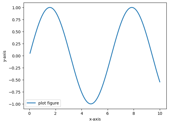
1.9 网格线
grid 函数
linestyle是网格线的格式color是颜色linewidth是线的粗度- 可以通过更改参数来获得最满意的搭配网格
python
import matplotlib.pyplot as plt      # 导入绘图库
import numpy as np                   # 导入数值计算库

x = np.linspace(0.05, 10, 1000)      # 生成 0.05 到 10 的等间距 1000 个点
y = np.sin(x)                        # 计算 y = sin(x)

plt.plot(x, y, ls='-', lw='2', c='y', label='plot figure')   # 绘制折线图(黄色)
plt.legend()                          # 显示图例

# 设置网格线格式、颜色、粗细(点状线、黑色、细网格线)
plt.grid(linestyle=':', color='k', linewidth=1)

plt.show()                            # 显示图形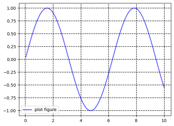
1.10 参考线
axhline添加水平线,axyline添加竖直线c是颜色,ls是参考线格式,lw是线的粗度,参数x和y分别指定位置
python
import matplotlib.pyplot as plt      # 导入绘图库
import numpy as np                   # 导入数值计算库

x = np.linspace(0.05, 10, 1000)      # 生成 0.05 到 10 的等间距 1000 个点
y = np.sin(x)                        # 计算 y = sin(x)

plt.plot(x, y, ls='-', lw='2', c='y', label='plot figure')   # 绘制折线图(黄色)
plt.legend()                                                 # 显示图例
plt.axhline(y=0.0, c='b', ls='--', lw='2')                   # 水平线
plt.axhline(x=0.0, c='b', ls='--', lw='2')                   # 竖直线
plt.show()                                                   # 显示图形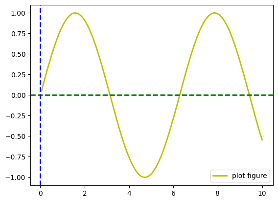
1.11 高亮区域
axvspan代表竖直区域,axhspan代表水平区域facecolor代表了区域的颜色,xmin、xmax、ymin、ymax代表了区域的范围alpha为透明度
python
import matplotlib.pyplot as plt      # 导入绘图库
import numpy as np                   # 导入数值计算库

x = np.linspace(0.05, 10, 1000)      # 生成 0.05 到 10 的等间距 1000 个点
y = np.sin(x)                        # 计算 y = sin(x)

plt.plot(x, y, ls='-', lw='2', c='y', label='plot figure')   # 绘制折线图(黄色)
plt.legend()                                                 # 显示图例
plt.axvspan(xmin=4.0, xmax=6.0, facecolor='g', alpha=0.3)    # 竖直区域(绿色)
plt.axhspan(ymin=0.0, ymax=0.5, facecolor='y', alpha=0.3)    # 水平区域(黄色)
plt.show()                                                   # 显示图形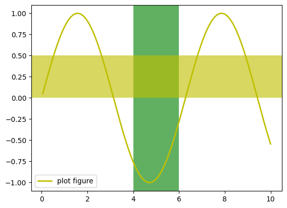
1.12 指向型注释文本
annotate 函数
xy给出被标记坐标位置,xytext给出文本的位置color文本代表颜色,weight代表是否加粗,arrowprops指定了箭头类型、连接方式和颜色
python
import matplotlib.pyplot as plt              # 导入绘图库
import numpy as np                           # 导入数值计算库

x = np.linspace(0.05, 10, 1000)              # 生成等间距点
y = np.sin(x)                                # 计算 y = sin(x)

plt.plot(x, y, ls='-', lw='2', c='y', label='plot figure')   # 绘制折线图
plt.legend()                                  # 显示图例

plt.annotate(
    "maximum",                                # 注释文本
    xy=(np.pi/2, 1.0),                        # 被标记点位置
    xytext=((np.pi/2)+1.0, 0.8),              # 文本显示位置
    weight='bold',                            # 文本加粗
    color='r',                                # 文本颜色
    arrowprops=dict(arrowstyle='->',          # 箭头样式
                    connectionstyle='arc3',
                    color='b')                # 箭头颜色
)

plt.show()                                    # 显示图形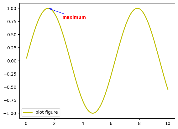
1.13 非指向型注释文本
text 函数
- 首先给出坐标位置,然后给出文本
- 颜色用
color来指定 weight是指文本是否加粗
python
import matplotlib.pyplot as plt      # 导入绘图库
import numpy as np                   # 导入数值计算库

x = np.linspace(0.05, 10, 1000)      # 生成等间距点
y = np.sin(x)                        # 计算 y = sin(x)

plt.plot(x, y, ls='-', lw='2', c='y', label='plot figure')   # 绘制折线图
plt.legend()                          # 显示图例

plt.text(3.1, 0.09, 'y=sin(x)',       # 文本位置与内容
         weight='bold',               # 文本加粗
         color='b')                   # 文本颜色

plt.show()                            # 显示图形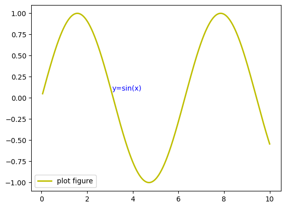
1.14 图形标题
title 指定文本,会默认绘制在图形上侧
python
import matplotlib.pyplot as plt      # 导入绘图库
import numpy as np                   # 导入数值计算库

x = np.linspace(0.05, 10, 1000)      # 生成等间距点
y = np.sin(x)                        # 计算 y = sin(x)

plt.plot(x, y, ls='-', lw='2', c='y', label='plot figure')   # 绘制折线图
plt.legend()                          # 显示图例

plt.title('y=sin(x) function')        # 添加图形标题

plt.show()                            # 显示图形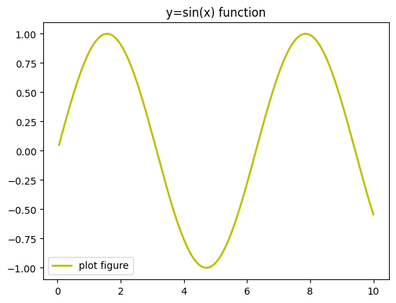
1.15 文本标签位置
plt.legend 函数
参数 loc 有种选择,按照位置去选择
| loc 值 | 位置 |
|---|---|
'best' | 自动选择最不遮挡数据的位置 |
'upper right' | 右上角 |
'upper left' | 左上角 |
'lower left' | 左下角 |
'lower right' | 右下角 |
'center' | 正中央 |
'center left' | 中左 |
'center right' | 中右 |
'right' | 中右 |
'upper center' | 上中 |
'lower center' | 下中 |
python
import matplotlib.pyplot as plt      # 导入绘图库
import numpy as np                   # 导入数值计算库

x = np.linspace(0.05, 10, 1000)      # 生成等间距点
y = np.sin(x)                        # 计算 y = sin(x)

plt.plot(x, y, ls='-', lw='2', c='y', label='plot figure')   # 绘制折线图

# plt.legend(loc='upper right')      # 可选位置示例(被注释掉)
plt.legend(loc='best')               # 使用 best 自动选择最优位置

plt.show()                            # 显示图形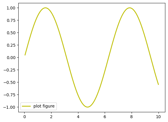
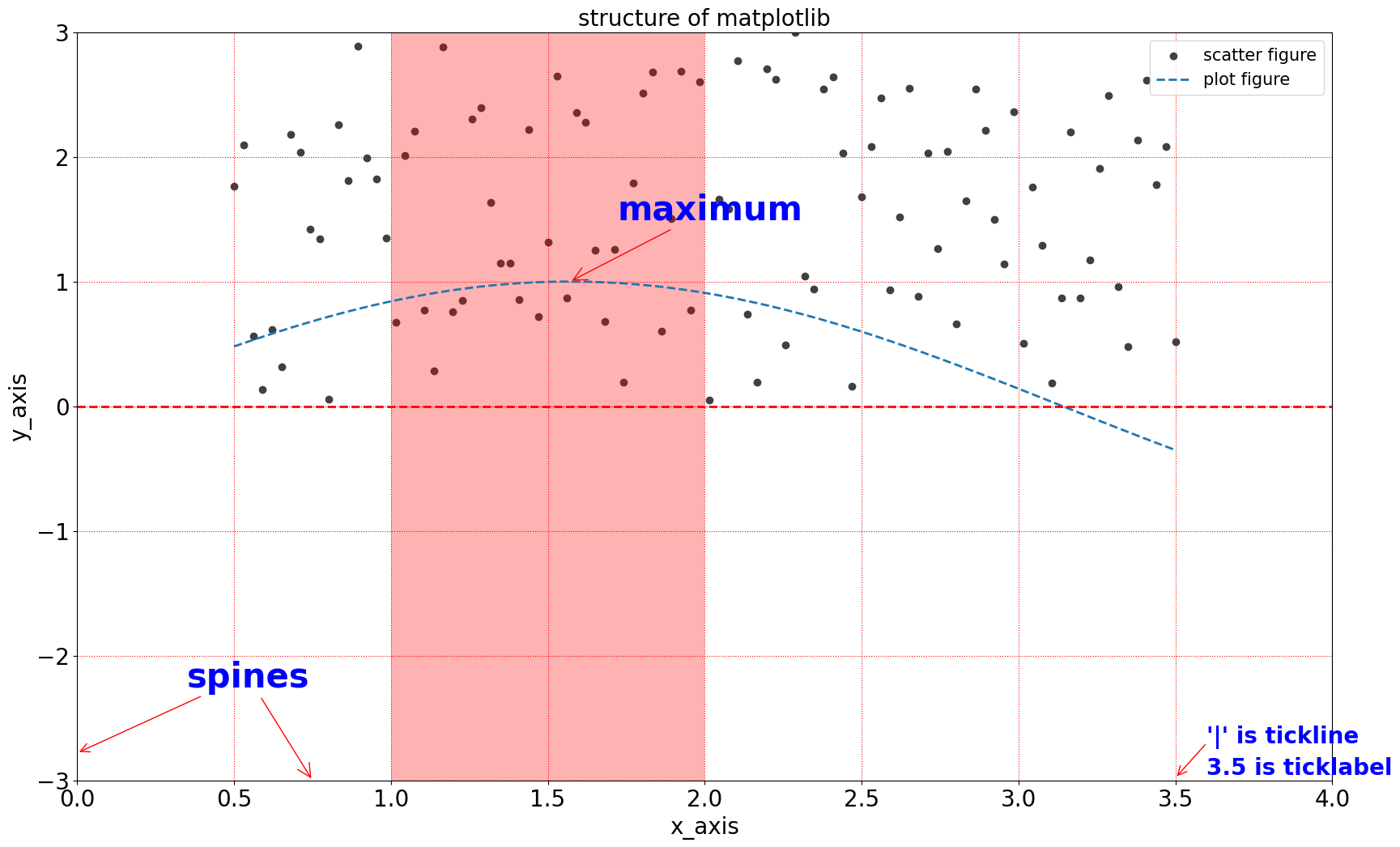
1.16 组间函数组合应用
plt.figure(figsize=(20,12))可以设置图片长宽尺寸plt.xticks(xlist, fontsize=20)可以指定 x 轴的刻度和字体大小
示例:
python
import matplotlib.pyplot as plt

plt.figure(figsize=(8, 4), dpi=100) # 默认figsize=(6.4, 4.8), dpi=100
plt.xticks([0, 1, 2], ['一月', '二月', '三月'], rotation=45)
组合实现复杂功能:
python
import matplotlib.pyplot as plt        # 导入绘图库
import numpy as np                     # 导入数值计算库
from matplotlib import cm as cm        # 导入matplotlib色图模块并简写为cm

# define data
x = np.linspace(0.5, 3.5, 100)         # 生成 0.5 到 3.5 的等间距 100 个点
y = np.sin(x)                          # 计算 y = sin(x)
np.random.seed(2024)                   # 设置随机种子
y1 = np.random.rand(100) * 3           # 生成 0~3 范围内的100个随机数作为散点y值

plt.figure(figsize=(20, 12))           # 设置图形尺寸

# scatter figure
plt.scatter(x, y1, c='0.25', label='scatter figure')    # 绘制散点图

# plot figure
plt.plot(x, y, ls='--', lw=2, label='plot figure')      # 绘制折线图

# set x,yaxis limit
plt.xlim(0.0, 4.0)                      # 设置x轴范围
plt.ylim(-3.0, 3.0)                     # 设置y轴范围

plt.xticks(np.arange(0, 4.5, 0.5), fontsize=20)   # 设置x轴刻度及字体大小
plt.yticks(np.arange(-3, 3+1, 1), fontsize=20)    # 设置y轴刻度及字体大小

# set axes labels
plt.xlabel('x_axis', fontsize=20)       # 设置x轴标签
plt.ylabel('y_axis', fontsize=20)       # 设置y轴标签

# set x,yaxis grid
plt.grid(ls=':', color='r')             # 设置网格线格式和颜色

# add a horizontal line across the axis
plt.axhline(y=0.0, c='r', ls='--', lw=2)   # 添加水平参考线

# add a vertical span across the axis
plt.axvspan(xmin=1.0, xmax=2.0, facecolor='r', alpha=0.3)   # 添加竖向区域

# set annotating information
plt.annotate('maximum', xy=(np.pi/2, 1.0),                  # 标记最大值点
             xytext=((np.pi/2)+0.15, 1.5), weight='bold', color='b',
             arrowprops=dict(arrowstyle='->', connectionstyle='arc3', color='r'),
             fontsize=30)

plt.annotate('spines', xy=(0.75, -3),                       # 标记spines说明
             xytext=(0.35, -2.25), weight='bold', color='b',
             arrowprops=dict(arrowstyle='->', connectionstyle='arc3', color='r'),
             fontsize=30)

plt.annotate('', xy=(0, -2.78),                             # 指向左下刻度线
             xytext=(0.4, -2.32), weight='bold', color='r',
             arrowprops=dict(arrowstyle='->', connectionstyle='arc3', color='r'),
             fontsize=20)

plt.annotate('', xy=(3.5, -2.98),                           # 指向右下刻度线
             xytext=(3.6, -2.7), weight='bold', color='r',
             arrowprops=dict(arrowstyle='->', connectionstyle='arc3', color='r'),
             fontsize=20)

# set text information
plt.text(3.6, -2.7, "'|' is tickline", weight='bold', color='b', fontsize=20)     # 文本:刻度线说明
plt.text(3.6, -2.95, "3.5 is ticklabel", weight='bold', color='b', fontsize=20)   # 文本:刻度值说明

# set title
plt.title("structure of matplotlib", fontsize=20)       # 设置标题

# set legend
plt.legend(loc='upper right', fontsize=15)              # 设置图例位置及字体大小

plt.show()                                             # 显示图形